CometChatMessageHeader component displays user or group details in the toolbar including avatar, name, status, and typing indicators. It also provides navigation controls and call buttons.

AI Integration Quick Reference
AI Integration Quick Reference
| Field | Value |
|---|---|
| Component | CometChatMessageHeader |
| Package | CometChatUIKitSwift |
| Inherits | UIView |
Where It Fits
CometChatMessageHeader displays the recipient’s information at the top of the chat screen. It’s typically used within CometChatMessages alongside CometChatMessageList and CometChatMessageComposer.
Minimal Render
Actions and Events
Callback Props
onBack
Fires when the back button is pressed. Use this for custom navigation handling.onError
Fires when an error occurs.Actions Reference
| Method | Description | Example |
|---|---|---|
set(onBack:) | Triggered when back button is pressed | Custom navigation |
set(onError:) | Triggered when an error occurs | Show error alert |
set(user:) | Sets the user to display | Configure header for user |
set(group:) | Sets the group to display | Configure header for group |
SDK Events (Real-Time, Automatic)
| SDK Listener | Internal behavior |
|---|---|
onUserOnline | Updates status indicator to online |
onUserOffline | Updates status indicator to offline |
onTypingStarted | Shows typing indicator in subtitle |
onTypingEnded | Hides typing indicator |
Custom View Slots
| Slot | Signature | Replaces |
|---|---|---|
listItemView | (User?, Group?) -> UIView | Entire header content |
leadingView | (User?, Group?) -> UIView | Avatar / left section |
titleView | (User?, Group?) -> UIView | Name / title text |
subtitleView | (User?, Group?) -> UIView | Status / subtitle text |
trailView | (User?, Group?) -> UIView | Right side (call buttons) |
listItemView
Replace the entire header content with a custom view.CustomHeaderView as a custom UIView:
leadingView
Customize the leading view (avatar area) of the header.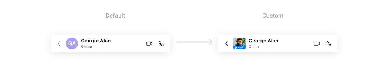
CustomLeadingView as a custom UIView:
titleView
Customize the title view of the header.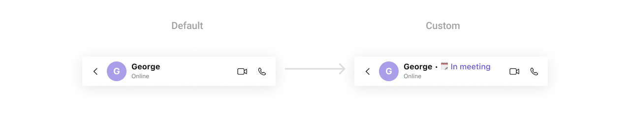
CustomTitleView as a custom UIView:
subtitleView
Customize the subtitle area (status, typing indicator).trailView
Customize the right side of the header (call buttons, etc.).
CustomTrailView as a custom UIView:
Styling
Style Hierarchy
- Global styles (
CometChatMessageHeader.style) apply to all instances - Instance styles override global for specific instances
Global Level Styling
Instance Level Styling

Key Style Properties
| Property | Type | Default | Description |
|---|---|---|---|
backgroundColor | UIColor | CometChatTheme.backgroundColor01 | Background color |
borderWidth | CGFloat | 0 | Border width |
borderColor | UIColor | .clear | Border color |
cornerRadius | CometChatCornerStyle? | nil | Corner radius |
titleTextColor | UIColor | CometChatTheme.textColorPrimary | Title text color |
titleTextFont | UIFont | CometChatTypography.Heading4.medium | Title font |
subtitleTextColor | UIColor | CometChatTheme.textColorSecondary | Subtitle text color |
subtitleTextFont | UIFont | CometChatTypography.Body.regular | Subtitle font |
backButtonImageTintColor | UIColor | CometChatTheme.iconColorPrimary | Back button tint |
backButtonIcon | UIImage? | System chevron | Back button icon |
privateGroupBadgeImageTintColor | UIColor | CometChatTheme.iconColorSecondary | Private group badge tint |
passwordProtectedGroupBadgeImageTintColor | UIColor | CometChatTheme.iconColorSecondary | Password group badge tint |
avatarStyle | AvatarStyle | AvatarStyle() | Avatar customization |
statusIndicatorStyle | StatusIndicatorStyle | StatusIndicatorStyle() | Online/offline status indicator customization |
typingIndicatorStyle | TypingIndicatorStyle | TypingIndicatorStyle() | Typing indicator customization |
Customization Matrix
| What to change | Where | Property/API | Example |
|---|---|---|---|
| Background color | Style | backgroundColor | UIColor.systemBackground |
| Title appearance | Style | titleTextColor, titleTextFont | Custom colors and fonts |
| Subtitle appearance | Style | subtitleTextColor, subtitleTextFont | Custom colors and fonts |
| Back button | Style | backButtonIcon, backButtonImageTintColor | Custom icon and color |
| Avatar look | Style | avatarStyle | AvatarStyle() with custom radius |
| Status indicator | Style | statusIndicatorStyle | StatusIndicatorStyle() with custom colors |
| Typing indicator | Style | typingIndicatorStyle | TypingIndicatorStyle() with custom font |
| Hide back button | Property | hideBackButton | header.hideBackButton = true |
| Hide status | Property | hideUserStatus | header.hideUserStatus = true |
| Disable typing | Property | disableTyping | header.disableTyping = true |
| Hide AI buttons | Property | hideNewChatButton, hideChatHistoryButton | header.hideNewChatButton = true |
| Custom subtitle | View Slot | set(subtitleView:) | See Custom View Slots |
| Custom menu options | Method | set(options:) | See Menu Customization |
Connection Management
Manually control the WebSocket connection for the message header.connect()
Establishes the WebSocket connection for real-time updates. Use this when you need to manually reconnect after disconnecting.disconnect()
Disconnects the WebSocket connection. Use this when you want to temporarily stop receiving real-time updates, such as when the view is not visible.Menu Customization
set(options:)
Sets custom menu options for the message header. These options appear in the header’s menu (typically accessed via a more button or long press).| Parameter | Type | Description |
|---|---|---|
options | ((User?, Group?) -> [CometChatMessageHeaderOption])? | Closure that returns an array of menu options based on the current user or group |
Props
All props are optional. Sorted alphabetically.avatarStyle
Customizes the appearance of the avatar in the message header.| Type | AvatarStyle |
| Default | AvatarStyle() |
dateTimeFormatter
Custom formatter for date/time display in the message header (e.g., “Last seen at…”).| Type | CometChatDateTimeFormatter? |
| Default | nil |
disableTyping
Disables typing indicators in the message header.| Type | Bool |
| Default | false |
hideBackButton
Hides the back button in the header.| Type | Bool |
| Default | false |
hideChatHistoryButton
Hides the AI chat history button in the header.| Type | Bool |
| Default | false |
hideNewChatButton
Hides the AI new chat button in the header.| Type | Bool |
| Default | false |
hideUserStatus
Hides the user status (online/offline/last active).| Type | Bool |
| Default | false |
hideVideoCallButton
Hides the video call button.| Type | Bool |
| Default | false |
hideVoiceCallButton
Hides the voice call button.| Type | Bool |
| Default | false |
onAiChatHistoryClicked
Callback triggered when the AI chat history button is clicked.| Type | (() -> Void)? |
| Default | nil |
onAiNewChatClicked
Callback triggered when the AI new chat button is clicked.| Type | (() -> Void)? |
| Default | nil |
statusIndicatorStyle
Customizes the appearance of the online/offline status indicator.| Type | StatusIndicatorStyle |
| Default | StatusIndicatorStyle() |
typingIndicatorStyle
Customizes the appearance of the typing indicator in the message header subtitle.| Type | TypingIndicatorStyle |
| Default | TypingIndicatorStyle() |
Events
The MessageHeader component does not emit any global UI events.Date Time Formatter
Customize how timestamps appear in the message header (e.g., “Last seen at…”) using theCometChatDateTimeFormatter.
Global Level Formatting
Instance Level Formatting
Available Formatters
| Formatter | Purpose | Default Format |
|---|---|---|
time | Standard time display | h:mm a |
today | Last seen today | Today at h:mm a |
yesterday | Last seen yesterday | Yesterday at h:mm a |
lastweek | Last seen within last week | Day name |
otherDay | Last seen older dates | MMM d, yyyy |
Common Patterns
Hide call buttons
Custom back button action
Custom subtitle with typing indicator
Minimal header
Related Components
- Messages - Parent component containing MessageHeader
- Message List - Display messages in a conversation
- Message Composer - Send messages in a conversation
- Conversations - Navigate back to conversation list