AI Integration Quick Reference
AI Integration Quick Reference
| Field | Value |
|---|---|
| Platform | iOS UI Kit |
| Package | CometChatUIKitSwift |
| Theme Class | CometChatTheme — Global theming system for all CometChat components |
| Primary Color | CometChatTheme.primaryColor = UIColor |
| Background Colors | CometChatTheme.backgroundColor01, backgroundColor02, backgroundColor03 |
| Border Colors | CometChatTheme.borderColorDefault, borderColorLight, borderColorDark |
| Typography Class | CometChatTypography |
| Typography Properties | Body.regular, Body.bold, Heading.regular |
| Example | CometChatTheme.primaryColor = UIColor(hex: "#F76808") |
Overview
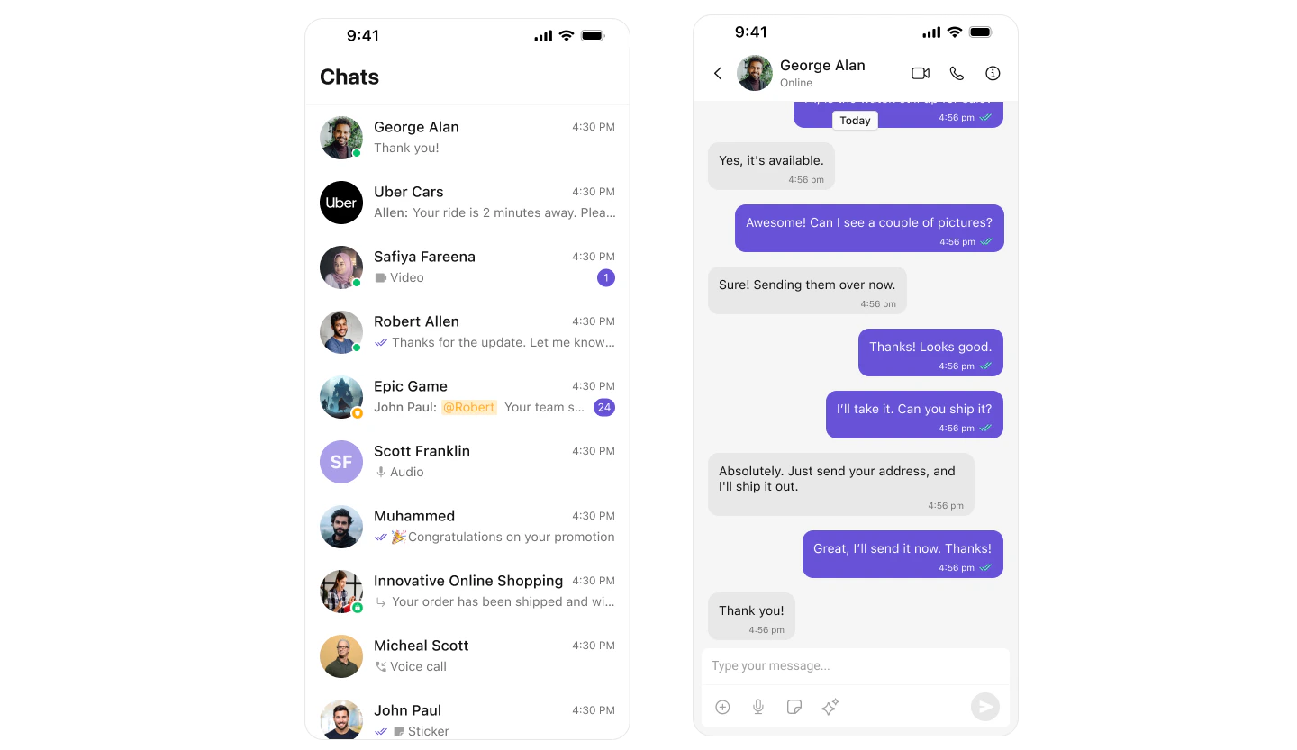
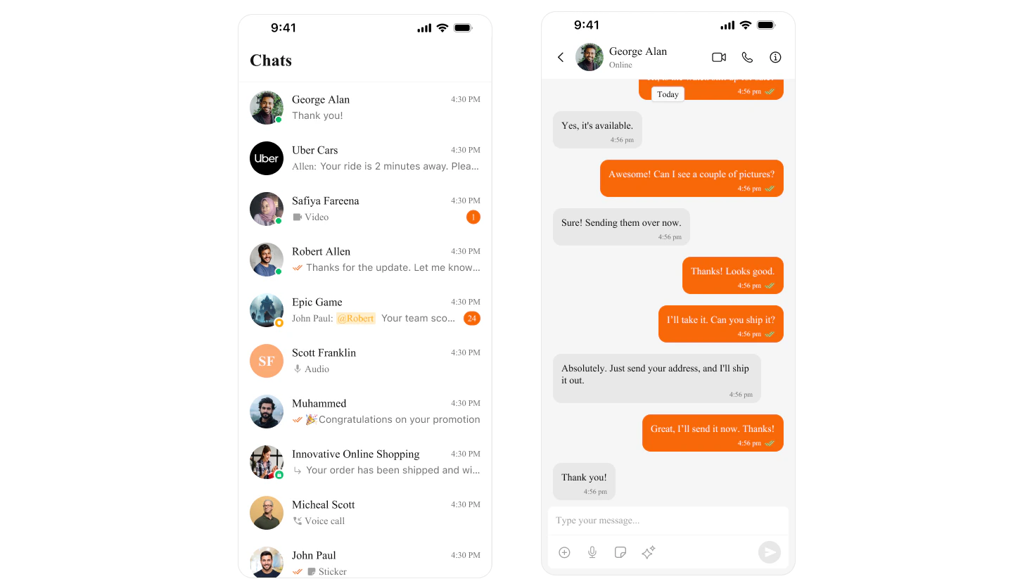
Theming in CometChat for iOS allows you to create visually consistent and customizable user interfaces that align with your application’s branding. TheCometChatTheme system enables global theming, customization of colors, typography, spacing, and component-specific styles to enhance the user experience across all CometChat components.
With global styles and an easy-to-override architecture, you can seamlessly apply themes at both a global and component level.
Using Theming in Your Project
Global Theming
Set up the global theme for your application during app launch. This ensures all CometChat components use the specified theme.- Swift
Customization
Customizing Colors
Override specific color attributes globally inCometChatTheme. This is equivalent to overriding attributes in Android’s themes.xml.
- Swift
Next Steps
Color Resources
Customize theme colors and dark mode
Component Styling
Style individual components
Message Bubble Styling
Customize message bubbles